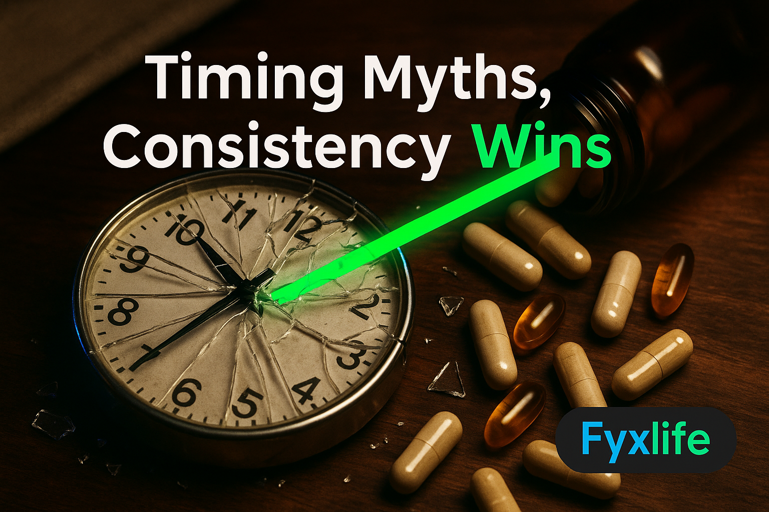
You wear the ring, check the score, feel vaguely guilty when it’s low — and then do exactly what you were going to do anyway. A study tracking 11 million days of real wearable data just gave that morning ritual a lot more scientific weight than most people realise. Here is what it actually found, what it cannot prove, and what it means for the way you use your device.
Most of us interact with our wearables the way we interact with a bathroom scale — a single moment of truth that either validates or condemns the day ahead. You glance at the number, feel a flicker of something, and move on. But that framing, it turns out, is almost exactly the wrong way to use the data you are generating every night. The research now emerging from wearable datasets at genuine epidemiological scale suggests your device is not a daily report card. It is something far more interesting — and far more useful — than that.
The Study at a Glance — What 11 Million Days of Data Actually Is
Who collected it, how long, and why the scale matters for you
A landmark study analysed 11 million days of longitudinal wearable data, making it one of the largest real-world investigations ever conducted into how physical activity metrics relate to health outcomes. To understand why that number matters, consider what was possible before it. Most clinical sleep or activity studies run for weeks, recruit dozens or hundreds of participants, and take place in controlled settings that bear little resemblance to your actual life. What researchers now have access to is the opposite of that: continuous, messy, real-world data from real people living real lives — commuting, travelling, staying up too late, skipping gym sessions, getting sick. That ecological validity, the degree to which data reflects actual lived behaviour rather than laboratory conditions, is what lifts this research above most that came before it.
For you, the practical implication is straightforward. Findings from a dataset this size are not extrapolations from a small sample. They are patterns robust enough to survive the full complexity of human variation.
The difference between ‘longitudinal’ data and a snapshot — and why it changes everything
Most wearable marketing focuses on what your device measures right now — your heart rate variability (the beat-to-beat variation in your heart rhythm, used as a proxy for nervous system recovery) last night, your deep sleep percentage this week, your readiness score this morning. That is snapshot thinking. Longitudinal data — meaning data collected continuously across months and years from the same individuals — tells a structurally different story. Patterns emerge that are invisible in any single reading. Relationships between variables that look like noise on a Tuesday become statistically meaningful signals across a year.
This is the core insight the research forces. Your wearable score is less like a daily exam result and more like a blood pressure reading taken repeatedly over months — one bad morning tells you almost nothing, but a consistent downward trend across three weeks is your body sending a message worth listening to. The dataset that made this finding possible is not a laboratory. It is the aggregate of millions of people doing exactly what you do: sleeping badly before a big meeting, bouncing back after a holiday, grinding through a quarter-end and wondering why they feel wrecked.
What the Research Found — Three Findings Worth Your Attention
Finding 1 — Activity metrics are early warning signals, not just performance scores
Here is the finding that should change how you read a low recovery score. Analysis of the data reveals a crucial distinction between what researchers call prevalent and incident associations — in plain English, the difference between a metric that reflects a health problem you already have and one that predicts a health problem you are heading towards. Wearable activity metrics appear to do both. A declining trend in your readiness scores could be a signal that something is already under strain in your physiology. Or it could be an independent warning that something is developing. Either way, it is not just telling you that your workout performance is slipping.
Insufficient physical activity is associated with higher risk of illness and premature death, and this research frames wearables as a scalable tool for detecting — and potentially reversing — that risk at population level. That reframing matters enormously. You are not using a performance toy. You are running a continuous, low-cost health screen on yourself every single night.
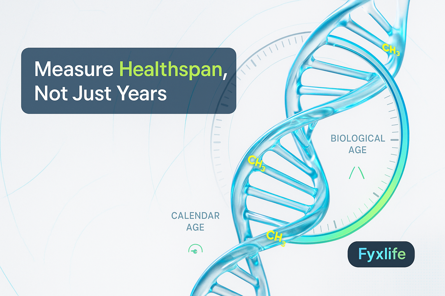
Finding 2 — Your wearable may be tracking your biological age, not just your workout
This is the finding that the longevity research community has been most animated about. A wearable-based aging clock published in Nature Communications links movement and recovery patterns captured by consumer devices to measurable aging biomarkers — the molecular and cellular indicators of how fast your body is actually aging, as opposed to how many birthdays you have had. Biological aging clocks (computational models that estimate your body’s functional age from physiological data) are not new, but building one from consumer wearable outputs rather than blood draws or clinic visits is a meaningful step forward.
What this means in practice: your recovery trend is not only reflecting how well you slept or how hard you trained. It may be reflecting the rate at which your biology is aging — and that is a signal worth taking seriously at 45 in a way it perhaps was not at 25. The research does not claim your wearable replaces a blood panel. But it does suggest the two are telling a more overlapping story than anyone assumed.
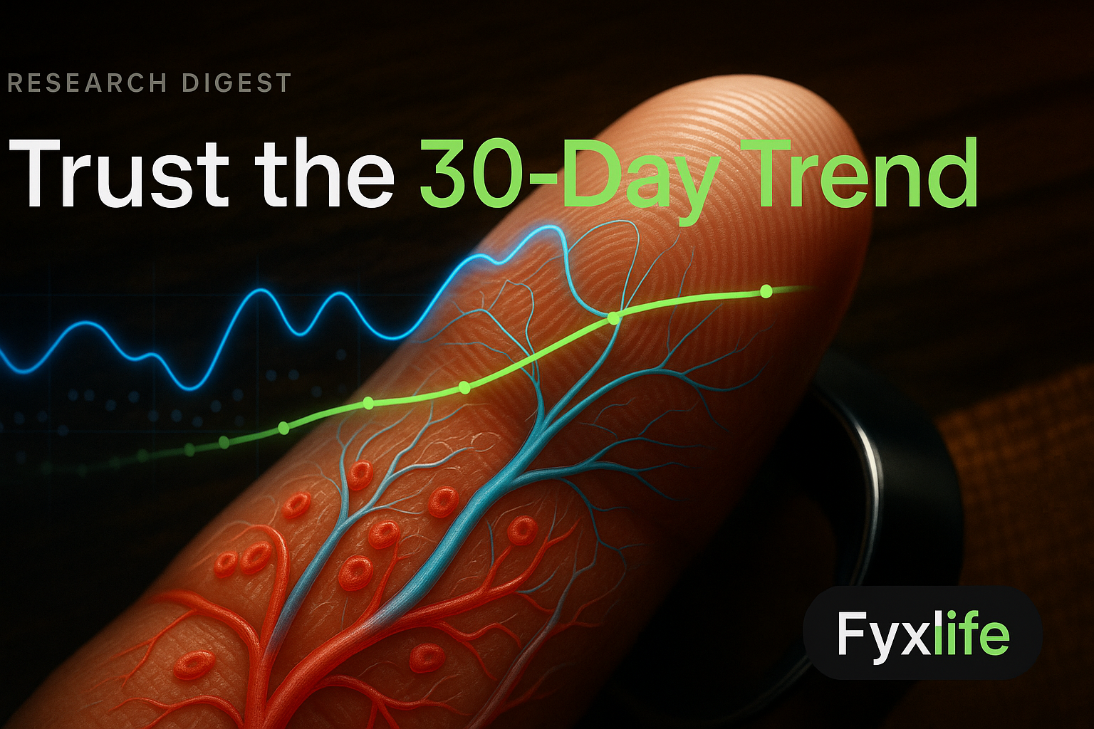
Finding 3 — Trend accuracy beats single-night precision every time
Rigorous independent assessments confirm that major wearable brands show steady improvements in detecting directional change over time, even where absolute precision on any single reading remains imperfect. No device is going to give you a clinically precise sleep staging breakdown on any given Tuesday. But every major brand is getting meaningfully better at telling you whether your recovery is directionally improving or declining across a week or month. That asymmetry — poor single-point precision, improving trend detection — is exactly why checking your score every morning and reacting to each reading is the least useful thing you can do with your device.
What This Study Cannot Prove
Correlation vs causation — why a low recovery score doesn’t diagnose anything
This needs to be said clearly, because the findings are genuinely exciting and it is easy to over-read them. The study identifies associations — patterns in the data where one variable moves with another. It does not establish that your recovery trend is causing any health outcome, or that improving your score will necessarily prevent one. A consistently low readiness score might correlate with elevated stress hormones, poor sleep architecture, or early metabolic dysfunction. It does not confirm any of them. Think of it as a raised eyebrow from your data, not a diagnosis. The eyebrow is worth responding to. It is not worth catastrophising over.
Consumer wearable accuracy limits: what independent assessments actually say
One user who analysed nearly 500 consecutive nights of their own sleep data put it well: the accuracy is imperfect and many variables cannot be controlled, but the directional correlations are consistent enough to guide decisions. That is an honest and useful framing. Your ring or watch is not a medical device. It does not measure heart rate variability the way a clinical ECG does. Its sleep staging is an algorithm’s best inference, not a polysomnography reading. Consumer interest in wearables that go beyond basic step-counting — covering recovery, stress, and sleep — has grown considerably into 2026, but that growing demand does not resolve the accuracy ceiling. What it does mean is that the data processing is improving fast, and the trend signal is already useful even where the absolute number is not gospel.
What It Means for the Tired Professional Checking Their Ring Each Morning
How to reframe your score from a daily grade to a trend signal
If you have ever switched wearables — moving from one brand to another, or from one algorithm update to the next — you will have experienced the disorientation of suddenly scoring differently without anything in your life changing. That experience is actually the most honest lesson your device can teach you. The absolute number is partially a function of the algorithm. The direction of travel is a function of you. A user moving between devices and struggling to know which stats to focus on, or what optimal even looks like, is experiencing in miniature exactly the tension the research is now resolving at scale: stop optimising for the score, start reading the trajectory.
Researchers at Texas A&M have noted that because many diseases are linked to lifestyle, wearables that help people make genuinely healthier choices could extend lifespan — framing recovery tracking not as a performance optimisation tool but as a preventive health intervention. That is a meaningfully different ask of your device, and it starts with looking at the line, not the number.
The one metric most wearable users overlook — and why the data says it matters most
Most wearable users focus on sleep scores, step counts, or workout strain. The metric the longitudinal data elevates above all of these is heart rate variability trend — specifically, whether your HRV is stable, rising, or falling over a rolling 30-day window, rather than what it read on any given morning. HRV is the beat-to-beat variation in the interval between heartbeats — a measure of how well your autonomic nervous system (the part of your nervous system that regulates heart rate, digestion, breathing, and stress response without conscious control) is recovering. A single low HRV reading after a poor night is meaningless noise. A three-week decline in your HRV baseline, without a corresponding increase in training load, is the kind of signal the 11-million-day dataset suggests deserves serious attention. Most wearable apps bury this trend view behind their flashier daily metrics. Find it.
The Single Most Useful Thing You Can Do With This Research Today
Pull up the last 30 days of your wearable’s recovery or readiness trend — not tonight’s score, but the directional line over the past month. If it shows a consistent downward drift across three or more weeks despite no change in training load, bring that trend graph to your next GP or health screening appointment and ask whether it warrants checking your HRV baseline, cortisol pattern, or inflammatory markers. A single bad score is noise. A 30-day trend is a signal worth investigating.